Two days ago, Microsoft announced the Surface, their new in-house tablet. Running Windows 8 or Windows RT (depending on the architecture), it appears to be a standard tablet with an interesting unique feature. The screen cover is in fact a keyboard, supposedly capable of detecting the difference between typing and when an arm or hand is laying across it.
Microsoft posted the announcement trailer on YouTube for all to see.
Right off the bat, I noticed two problems. The first is that according to reports, the Surface will not be sold everywhere. It can only be purchased online and through the Microsoft Store’s retail locations, as opposed to the iPad’s wide availability. The second is that Surface is a quickly recycled name. Until recently “Surface” was the name given to what is now called PixelSense, which is a technology used for touchscreen displays in large environments such as furniture. Harrah’s and Microsoft, for example, made a big deal over the fact that Microsoft Surface/PixelSense displays were installed in the iBar at the Rio in Las Vegas.
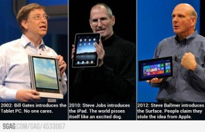
Of course, cries from some started coming out that Microsoft was ripping off Apple once again. This prompted an image meme I saw on a friend’s Facebook page yesterday.
To be perfectly honest, there’s some truth in both sides of the argument.
I don’t think anyone can seriously argue that Microsoft isn’t the first to market in some areas of technology, like tablets and phones. The “rip off” (if one wishes to use such a loaded and inaccurate term) is quite a bit more subtle than that. What happens is that Microsoft is the first to market, but its implementation of the technology is clunky at best. Eventually, Apple brings its own version to market, which becomes very popular due to their attention to quality and usability. Microsoft then looks at what Apple did, and re-engineers its products to fix the problems that Apple’s implementation corrected.
For example, let’s look at cell phones. I’ve personally used three different cell phones that used Microsoft’s Windows Mobile operating system: the Cingular 8125, the Cingular 3125, and the AT&T Tilt. While I enjoyed using the phones because the available software was more varied than the Blackberry devices of the time, the interfaces themselves tended to be awkward, and stability was never a sure thing. Once the iPhone 3G came out (the first version with Exchange ActiveSync support), I switched over and marveled at how intuitive it was to use. After that, Windows Mobile devices seemed even more painful to use. Since then, Microsoft has abandoned Windows Mobile and released Windows Phone 7, which is a far more efficient phone operating system using the Metro UI planned for Windows 8.
Tablets are another example. I’ve seen tablets as far back as 2004, when we purchased a tablet PC for the COO of the company I was working for at the time. To say that the tablet was terrible is, in my opinion, an understatement. While the unit had a touchscreen, a special stylus was needed in order to be able to write on it. Also, the operating system on the tablet was Windows XP Professional. While Windows XP is a great desktop OS, it’s absolutely miserable to use on a touchscreen. I’m not sure how the COO tolerated using that machine outside of a docking station. Of course, once the iPad came out, Microsoft’s tablet ambitions started gearing towards Windows 8/RT with their Metro interface.
Of course, there’s no guarantee that Microsoft’s Surface tablet will be a success like the Xbox 360 or a failure like the Zune. I personally admit to some trepidation, if only because of Microsoft’s OS strategy. Unlike Apple, who has one OS line for its desktop/laptop machines (Mac OS X) and another for its phones and tablets (iOS), Microsoft is using Windows Phone for phones only, while Windows 8 will be used on tablets and desktops/laptops. I’m not sure how well that will work out for them; while Metro works great for a touchscreen interface, I’ve tried it in a desktop environment (VMware virtual machine running Windows 8 Consumer Preview) and it was absolutely terrible. Worse, Metro is the default UI and disabling it is not possible. With a keyboard and mouse, Metro is unintuitive and frustrating to figure out.
Of course, only time will tell whether Microsoft’s strategy will work out for them. Unfortunately, while they look to Apple to fix where they went wrong beforehand, I fear they didn’t learn the proper lessons or implement the proper corrections.


